14 for 14: New Layout Object Formatting and Styling Options
By Daniel Wood, 3 June 2015
Better than ever!
FileMaker just keeps getting better! With 14 we have more flexibility than ever before when it comes to creating gorgeous looking solutions. A number of a new layout styling options help make this possible. In this article we cover some of the new layout object styling options.
Placeholder Text
Not so much a new style property as it is a new feature that can also be styled. Placeholder text is fully styleable in the same way a text label is. Check out this article on placeholders for more information and other cool applications of placeholder text.
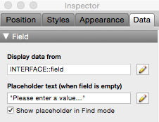
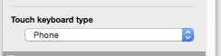
Touch Keyboard Control
With FileMaker 14 you now have total control over which keyboard to use for any layout object on iOS devices. You can specify a keyboard that is most relevant for the field type. This option is on the data tab of the inspector.

You can also now disable the touch keyboard programatically using the new script step:
Enable Touch Keyboard [ Off/On ]
This is useful in read-only solutions, or fields where you want the user to be able to enter it and scroll (think large text boxes) but not edit. A script trigger could be utilised to turn the keyboard off when entering (and on when exiting).
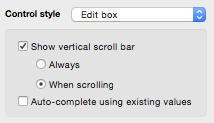
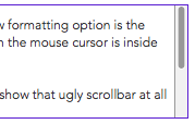
Better scrollbars for portals and fields
This is one of my favourite new features for creating beautiful solutions. Both portals and fields now have additional scrollbar options. These allow you to not show the scrollbar unless the portal/field is being scrolled. They look much more like native OS scrollbars and it means you need not show FileMaker's standard scrollbar all the time. The scrollbar only appears when scrolling, or when the mouse is placed over the scroll area. This option is on the data tab of inspector under control style.
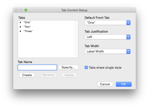
Easier Tab control styling.
Tabs have been improved when it comes to easier styling. You can now define style properties that are automatically applied to each individual tab. Prior to 14, each tab of a tab control object was styled individually and you had to select every tab if you wanted to style them all at once. This inevitably led to tabs being setup with different styles.
Now it is simply a case of ticking an option in the tab control setup to allow you to define one style for all tabs.
Field control over button & Icon
Fields that use the control style of popup, drop-down or calendar now have more formatting control over the button area and the icon:
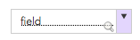
The button area is the right hand side section that is clickable to initiate the drop-down or calendar. This area has full styling options now in all of the states.
The icon can have its colour changed in all of the states such as hover, in-focus and pressed.
Using these new formatting options you can build some very nice looking fields.
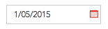
The icon is also styleable through conditional formatting, this means you can impelment some cool features such as having the icon appear grey/disabled if the field is not required. You could also utilise icon colour to indicate an error with the field.
Consider a date field where you want to visually indicate whether the entered value has expired:
The icon can be conditionally formatted as such:
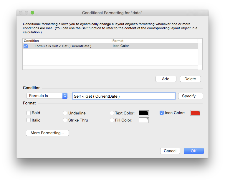
This creates a really nice visual cue for expiration as opposed to filling the entire field red, or any extra labels.
Icons cannot currently be changed - you are restricted to the standard arrow/calendar icons, but hopefully this will change in future given the new icons we can setup for buttons.
Checkboxes and Radiobuttons
There have been some additional styling options added to both checkboxes and radiobuttons.
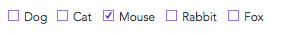
The first thing you may notice above is that the checkbox actually now shows a tick. This is a customisable option via the control options and is available for checkbox sets only:
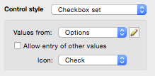
Check is the new option, and the default is "X".
Checkboxes and radiobuttons also now have full styling for the "button" and "icon". In the case of these controls, button refers to the square checkbox, or the circular radiobutton. Icon refers to the contents of those - either the tick/X for a checkbox, or the inner circle for a radiobutton.
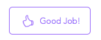
Buttons and Button Bars
Both of these are topics we'll cover in other 14 for 14 articles, but it is good to reiterate here that buttons now have more customisation options available with the introduction of icons. With a standard button you can control the icons colour (providing the icon is either a standard FileMaker icon, or an SVG inserted).
With button bars you can control all the style options that buttons have, with a couple of additions:
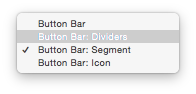
The Segment and Icon areas are the main formatting options for the buttons on a button bar. Dividers are literally just the dividing lines between segments, and button bar has styling options common across all segments such as the border outline, outer shadow and rounded edges.
Example File
We have included a demo file with this article so you can check out all of the new formatting options for yourself.