A Sliding Drawer that Opens and Closes on Mouse-Over
By Daniel Wood, 1 July 2014
Introduction
The slide control is an exciting new layout tool introduced in FileMaker 13. Because of it's primary function of sliding via a swipe, it is built with FileMaker Go in mind. However it is quickly finding it's place in FileMaker Pro with a number of cool uses for it being introduced into the community.
The slide control is one of the first UI tools that has animation built into it. The action of moving from one slide control panel to another can be animated (or not animated) by way of script. We can also script the navigation between slide panels. For these two reasons the slide control becomes a good candidate for a number of other UI patterns, one of which is a sliding drawer.
What is a Sliding Drawer
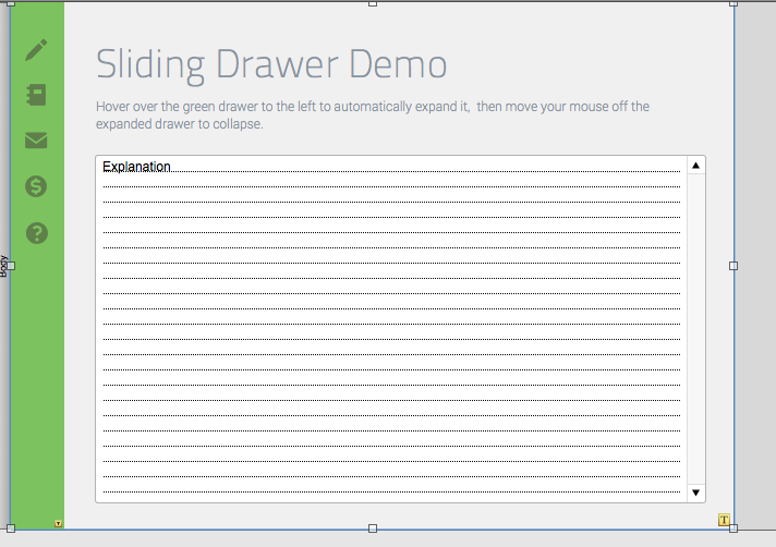
A sliding drawer (also known as a Navigation Drawer) is a control which expands to fill a larger portion of the screen when either pressed, hovered over with the mouse, or swiped with the finger on a touchscreen device. They generally appear on the left edge of a screen, but can be on any edge if desired.
The drawer is most useful when the screen does not have enough room on it to contain further functionality and actions. These can be placed in the drawer and the drawer can be opened when required to give access to the additional functionality.
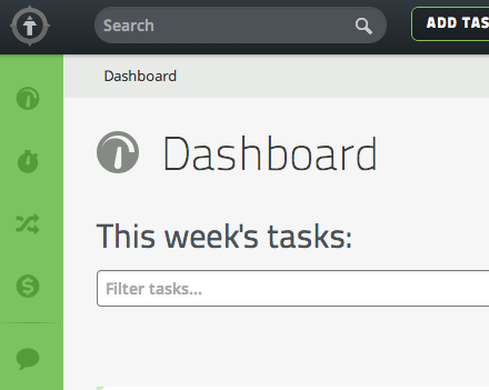
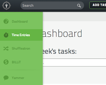
Here is an example of a website that contains a sliding drawer. The first image shows the collapsed drawer. When the mouse is placed over the drawer, it expands with an animated effect, revealing the full contents. Moving the mouse off the expanded drawer will collapse it.
So what is this article all about?
In this article we are going to build a sliding drawer, but not just any sliding drawer. This is one that will also animated, but also be activated upon hovering the mouse over it. The drawer will also collapse upon moving the mouse off the drawer, just like in the website example above.
The demo file for this article has been in progress for a while now and I had been tinkering with it from time to time but never ready to publish. Recently, there have been a couple of great articles concerning sliding panels which prompted me to get my arse into gear and publish this one too.
One of those was from John Sindelar from Seedcode who published this great article in which he presents an animated sliding panel example. In his demo, the user initiates the slide panel by clicking a button to reveal it, and another click to hide.
This is a great demo for showcasing what can be done with slide panels in FileMaker Pro, how to structure a panel object for this sliding effect, and how can it can be implemented.
I wanted to take this one step further however and remove the need for the user clicking a button to initiate the drawer expanding - wouldn't it be cool if you could just put your mouse over the draw to initiate it, similar to the web?
Wait a minute, did you say mouse-over?
Yes that is correct. The mere act of placing your mouse cursor over the panel will expand it. So how is this possible? FileMaker has no native mouse-over functionality, and in order to expand and collapse the drawer we obviously have to run a script. So how can we initiate a script based on where the mouse is?
The answer is tooltips.
The method we are using to determine where a mouse cursor is on the layout is to place tooltips on the layout. The calculation within the tooltip will be evaluated whenever the mouse cursor falls over the tooltip. This evaluation of the tooltip occurs almost instantly and repeatedly each time the mouse is moved (even though it may still take 1-2 seconds for the tooltip contents to normally appear).
So now it boils down to what we put in our tooltip as to how we can control opening/closing the drawer.
We are in fact also making use of a script-triggering plugin. This plugin will run a script via our tooltip calculation upon detecting we need to either open or close the drawer. But we are getting ahead of ourselves, first things first, lets dive into how it all works.
It may be a good idea at this point if you are following along to download the demo file so you can dissect it all as you read.
Panel Setup
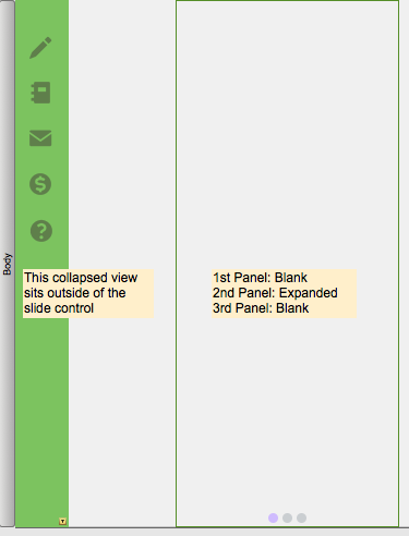
The first part of the puzzle comes with setting up a sliding control. Our control contains 3 panels. The first of which is blank, the second contains the expanded drawer view, and the third blank.
You may be wondering why we have the first and third panels as blank. This is to do with achieving the correct animation effect when the drawer is opened. The correct animation is to show the drawer expanding from left to right. To actually achieve this, we must animate the navigation from panel 3 to panel 2.
The reason our panel #1 is also blank is because unlike a tab control object, we cannot determine the "default" panel to show - it is always panel #1.
In the picture below I have moved the drawer off to the side and shown the dots on the panel for reference. Also note that our collapsed view of the drawer sits outside of the slide control object altogether. The reason for this is a little hard to explain, but it comes down to the speed at which tooltips are evaluated, and the resulting triggered scripts are run. With the closed drawer inside the slide control, we ended up in testing with lots of unusual things happening!
Tooltip that activates the drawer
Let's have a look at the tooltip calculation that is responsible for opening the drawer. This tooltip is set on the green rectangle panel that is the representation of the drawer in its closed state:
Wow how easy is that, only one line of code!! Well, okay maybe not, but as you can see we have abstracted the code into a custom function. The reason for this is re-use. The same code is going to be used to both open and close the drawer. Let's take a look at the custom function.
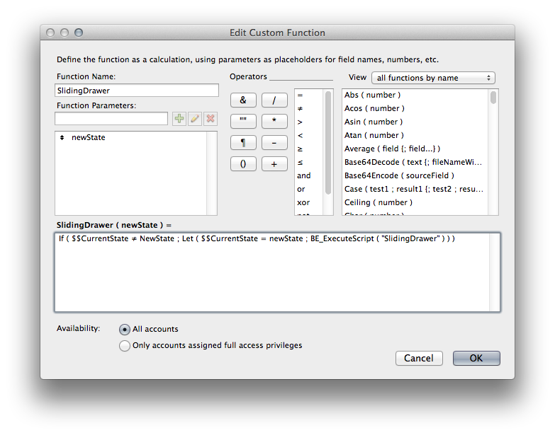
Still one line, jackpot! The function is passed a keyword - on or off - to determine what action the mouse-event is trying to perform. In this case hovering over the closed panel will attempt to open the panel, so we pass the parameter "On".
Inside our function, we are comparing the new requested state of the drawer, to a global variable we have called $$CurrentState. This variable will contain a keyword that tells us what current state the drawer is on, be it on or off.
If the new state is different to the current (e.g. current state is off, and user wants to turn it on) then the LET statement within the function is executed.
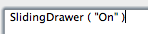
This part will change the $$CurrentState variable to our new state, and then carry out a script called SlidingDrawer which is responsible to changing the drawer state.
Note here we are using the very awesome and free BaseElements plugin from Goya to trigger the script, but you can use any script triggering plugin you want. The demo file comes bundled with the plugin and it should auto-install on startup if not already installed.
A Note on plugin use
Plugins are always something people are naturally skeptical of, but these days plugins are so simple to install in FileMaker that their use should not be seen as an issue. This particular implementation of a sliding drawer is a desktop-only implementation, so a plugin should be fine to use (This method makes no sense on FileMaker Go as there is no mouse).
For WebDirect users, at this point this method will not work as plugins work as long as they are server-side, but our process references a global variable that is client specific so won't work. If anyone wants to work on a WebDirect implementation it would be more than welcome :)
The script to open/close the drawer
The SlidingDrawer script is also pretty simple:
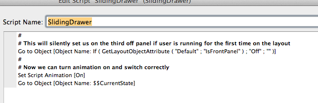
Essentially all it does is turn on the animation effect and go to the required state of the drawer via object name. We have named the on and off panel objects accordingly.
The first script step is a non-animated panel change. This is only required once the first time the drawer is used on the layout. Recall earlier we mentioned panel #1 is always the default visible panel, but that to achieve the correct animation effect we must begin from panel 3. This step ensures that before the animation takes place, we switch from panel #1 to panel #3 if need be. We have named panel #1 "Default" in this case.
Thanks goes to John Sindelar again for this bit of code from his example file, as this was an issue I was struggling with before seeing how he achieved it!
Okay so the drawer is open, how do we close it?
The drawer is closed in exactly the same way as it is opened, via a tooltip. This one however is a bit more of a messy affair. Opening the drawer is easy, we just put the open tooltip on the closed version of the drawer. However closing the drawer will occur if the user puts the mouse anywhere on the layout that is not over the expanded drawer, so how do we do that?
The easiest way - and the way the demo file does it - is to create a large blank text object, and overlay this across the layout with the required tooltip attached.
We define the ordering of tooltip objects on the layout as such so that our closed drawer is at the front, followed by our panel object, and the closing tooltip underneath that. All the other layout objects lie underneath our close tooltip.
You can see in the image above the tooltip object as it sits on the layout.
If you make this overlaying tooltip transparent fill, then a very cool thing happens. If you have other objects on your layout with their own tooltips, then these will continue to work even though those objects are underneath your closing tooltip. But the closing tooltip will still evaluate, as will those other underlying tooltips.
The net result is that your sliding drawer will close, and then any tooltip on any object where your mouse ends up will show.
The only downside to the implementation is you end up with this large object covering most of your layout contents which can make developing a pain. You'll just have to move this object off your layout while developing - but don't forget to move it back on when done or your drawer will not close!
Ensuring the drawer sits in front of everything
One of the limitations of a slide control panel is that underlying objects can still be clicked into and pressed. When our drawer is in its open state, we want to ensure that any layout objects under the drawer are disabled and that the drawer is the only object that can be interacted with within that space.
The solution is quite simple - turn the drawer object into a button. In the example file we use a rectangle object for the open drawer. To set it up you can do the following:
- Turn it into a button
- Set the script step to "Exit Script"
- Disable the option that uses the Hand Icon
- Switch to the "Pressed" state of the Rectangle
- Change the pressed fill colour to a colour very similar to the normal colour, but fractionally different.
That last point is key. If you set the pressed colour to the same as the normal colour, FileMaker will still add its normal grey pressed colour to the button. We want to give the appearance that this is in fact not a button at all. So to do this, make a minuscule change to the colour, so small a normal user could not perceive the colours being different. Now when the user clicks on the rectangle, nothing seems to happen. In fact the Exit Script step is run, but this has no real effect on anything. Because it is now a button, it will sit in front of all underlying objects, blocking them.
Current Limitations
This specific demo layout has been tested extensively during development, but not much testing has been done at all for other scenarios, such as:
- Multi-Windowed environments
- Multiple layouts
- WebDirect
- Multiple panels per page (though this is probably a bad design choice anyway).
The example actually will not currently work with multiple windows as both windows would rely on the same $$CurrentState variable, even though drawers on both windows may have their own state. I do think though this could be quite easily remedied through some tweaks to the custom function and script. Consider generating dynamically named variables for each window, perhaps named using the window & layout name, and then passing the required new state to the script. This would remove the need for the script to reference a global variable, and would mean each layout in each window would have its own variable to control its current state. I would love to see an implementation that does this
Example File
Please find attached an example file. This file is provided to help you fully understand what is going on in this article. Note that FileMaker 13 is required to view this example file. The file also contains both windows and mac versions of the BaseElements plugin from Goya, and has been set to install silently on startup if you do not already have this plugin installed.
Click here to Download the Example File
Update - New Demo Files from Users
Denis Somar has kindly contributed an awesome modification to the demo file which makes use of popovers to produce the active panel. He noted that popovers have the highest z-level ordering of any object on the layout and thus can be used as the active panel to cover any underlying objects. The demo file he produced works in table-mode and is a very cool take on the traditional drawer, I urge you to check it out! (also check the comments for more information from Denis)
You can download the example file here
Another reader, Joel Shapiro (who did a great article also about sliding drawers using web viewers here) has also contributed a modification to the demo file. His suggestion can be found in the comments, but he noted that by offsetting the slide control 48px to the right (such that it sits to the right of the collapsed panel) the end result is a much smoother transition effect from collapsed to expanded panel. The one downside here is the area occupied by the collapsed panel is not usable when expanded, however I'm sure someone out there will be able to offer up a fix!