Swipe Out!
By Daniel Wood, 13 December 2017
Introduction
In our previous article, we built beautiful drawer menus for desktop and iOS. These menus were horizontal in that they would slide in from either the left or right side of screen. This is achieved either through using a slide panel object, or through layout transition effects available in FileMaker Go (if you wish to have your menu as a separate layout). The sliding panel layout object gives us the power to use left/right swipe gesturing to close (or open) the menu.
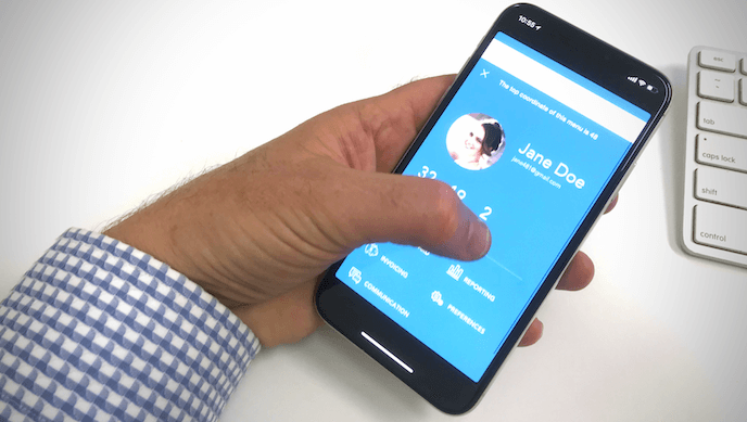
But what about vertical menus? That being a menu that slides up from the bottom of screen. In FileMaker Go you can achieve this effect through using the ‘Slide in from Bottom’ layout transition - brilliant! The user can then press a close button on the menu to reverse the process through using a ‘Slide out to Bottom’ transition effect, returning the user to their original layout.
However one key element is missing from this equation which provides a much more intuitive and native iOS feel to this menu - the ability to swipe-down on the screen with your finger in order to dismiss the menu. In our horizontal menus, left and right swiping can be utilised through a panel control, but how do we achieve swipe down (or up for that matter)?
First attempt using a sliding panel
When this challenge initially arose my first thought was to just use a sliding panel again. It already has swipe gesture, so surely there is a way to ‘flip it on its side’, right?

Unfortunately not! The rotate option is not supported for slide panels in FileMaker Pro - dang! But wait! All layout objects are just somes FileMaker XML and CSS underneath it all, so what if I could just modify that XML to add my own rotation? To do this, I used myFMButler Clip Manager to retrieve and modify the XML:

The rotation attribute can be seen above, we just modify it from 0 to 900 in order to rotate 90 degrees.

Voilà! Now we’re cooking! But does it work? Well yes and no. It works in the sense that you can click the dots to navigate the panels and you can script moving between panels. However actually putting anything useful inside the panel becomes a nightmare. If you copy/paste something simple like a label inside the panel, you’ll note it immediately rotates 90 degrees also to be in the same orientation as the panel. You can then rotate it again to have it correctly oriented. This is fine for simple things, but for more complex menus this becomes a real challenge to have the objects properly rotated and positioned.
And then there is the positioning of objects. Using the keyboard it is somewhat manageable but given the rotation of the panel, all the directions are also rotated. So the up arrow moves an object right, the right arrow moves it down, and so on. But once you reach for the mouse and drag the object, then things reach a whole other level of weird as illustrated in this short video below.
So basically the panel was a no go. Couple with the fact that when the panel was tried in FileMaker Go, the swipe gestures were still left & right even after it was rotated - the final nail in the coffin.
Back to the drawing board…
So now what? How else can we do a swipe down gesture? Other possibilities arose such as using the onGestureTap trigger, but this only capture finger taps, not swipes.
Then I thought of this:

It’s called the rubber band effect, and is an effect that has been in FileMaker Pro/Go for a few versions now. (FULL DISCLOSURE: I am completely ignorant of FileMaker on Windows so have no idea if this is present there).
In FileMaker when using a scrolling device in FileMaker Pro or your finger in FileMaker Go, you can effectively drag the layout down/up beyond its normal position. When you release your scrolling device, the layout ‘bounces back’ to its original position. A seemingly useless artefact of the operating system one would presume, particularly when it relates to FileMaker Pro and seemingly has no use. This rubber band scrolling was first introduced with the original iPhone (you can read all about it on Cult of Mac)
In more recent times however this rubber band effect has been utilised as a method to perform some secondary action in iOS apps. Most notable of those is to refresh the current view. Apps like Instagram, Facebook and Strava to name a few all utilise this swipe-down-and-release to refresh the current page.
But can we use it in FileMaker?
That was the 64 million dollar question. This is as close (currently) to a swipe-down effect as we have. Can it be utilised to somehow perform a script when the user swipes down to produce the rubber band effect?
To make any use of it, we need to be able to detect when the rubber band effect is being performed, and secondary to that, we need to be able to control at which point during the effect we should be triggering a script to perform an action, in this case closing the menu.
GetLayoutObjectAttribute provides the solution
Our trusted friend - GetLayoutObjectAttribute - comes through in the clutch for us yet again. This handy function can tell us some useful properties of layout objects. In this case we use the “Top” coordinate property of a layout object.
On our layout, we place an object. It doesn’t really matter where on the layout it is placed, or what type of object it is. Give that layout object a name. Now we can use GetLayoutObjectAttribute ( “ObjectName” ; “Top” ) to determine where that object is relative to the top of the window.
The key point here is that the top attribute of a layout object changes during the rubber band effect. As the layout is moved down the screen, all of the top coordinates of objects on the layout increase. Conversely, they decrease as the layout is swiped up - even into negative coordinates for those that go above the top of the screen.
So to recap: When you first go to the layout, the object will have a top coordinate. Then, as you drag the layout down, the top coordinate of that object increases. Are you beginning to see how this can be useful?
An onTimer pulls everything together
Knowing that the top coordinate increases is not quite enough. We need some means by which to detect when the top coordinate hits a given value, and to run a script at that point. There is no such thing as “onRubberBandEffect” trigger sadly!
To do this we use an onTimer script. When the user first enters the menu layout, we install an onTimer to run every 0.1 seconds. This script is tasked with checking the top coordinate of our special object and waiting for it to reach a certain value. When that value is reached the script performs the desired action - in this case closing the menu.
For all of this to work smoothly, our onTimer script should not reference, or set any record data. It should also be doing no heavy lifting such as refreshing the window or committing records. These actions would cause slight pauses in the script execution and create a bad user experience because the user will see that there is something running in the background.
Fortunately in this case our script can be very light weight - all it does is evaluate the GetLayoutObjectAttribute function, and check to see if it is at a given value, if not, it does nothing. Given this is so quick and low cost, the user has no visual indication that a script is running at all which is exactly what we want!
What does our onTimer script do?
The purpose of the onTimer script is pretty simple, and can be summarised as below:
- When the menu loads, store the layout objects top coordinate for future use
- Subsequently, compare the current top coordinate of the object with its original coordinate
- When the top coordinate hits a nominated value greater than the original coordinate, close the menu
And that’s it, pretty simple!
To illustrate what the top coordinate is doing, have a look at the video below which shows our demo file in action. As we drag down with our finger, you’ll see the top coordinate value at the top of screen increase. When it hits our designated position, we close the menu, and thats all there is to it!
Well, not quite all there is to it, there is one more thing
Not all layouts exhibit the rubber band effect. Your layout has to be setup in just the right away in order to produce the rubber band effect. The rubber band effect only appears when the layout is scrollable and so if your layout dimensions are too perfect (i.e. they match exactly your devices dimensions) then you may not end up with any scrolling at all.
The answer is to make your layout just slightly taller than the default height by a few points. Not enough to give any hint of a scroll bar, but just enough to introduce the rubber band effect. You don’t need this on every layout, just those where you want to utilise this technique.
Other potential uses
I hope this article has sparked some other ideas and potential uses for you. One such idea we thought of would be to replicate a native applications use of the rubber band effect to carry out a refresh action. You may be developing an offline solution which pulls data from a remote location, or your layout might simply require a ‘refresh window’ every so often to keep it up to date.
Native apps tend to put an icon in the refresh area that reveals itself during the rubber band effect. Can we do the same in FileMaker? Well surprisingly again the answer is yes!

This grey area shown above that reveals itself during the effect is actually the ‘layout background’ style.

It is accessed by making sure no other object or part is selected on your layout. Options are fairly limited and you only really have a fill option. One of the fill options however is to use an image. If you use an image as your layout background then this image reveals itself as you drag down on the layout!
Simply set your background image to one with a reload icon positioned at the top of it, and this should appear as you drag. In the video below we show what this looks like. Our background image is relatively the same size as our device screen. Most of the image is a transparent png, with a little refresh icon at the top of the image.
Finally a nice wee gem in the Demo file
I’ve included a bonus technique inside the demo file (completely unrelated but equally awesome). The technique is very simple and is an easy way to render SVG animations inside a web viewer. Check out http://loading.io to accompany this - a very awesome website with some amazing tools to use in conjunction with this technique. Give your solutions a bit more vibrancy and visual feedback.
Demo file
No weetbicks article would be complete without a demo file to accompany it. You can download the demo file below. Once you’ve read the article everything should be fairly straightforward and make sense. Just note that to really get the most out of demonstrating the technique you should be using it on an iPhone or iPod touch. While Macs also have the rubber band effect, it doesn’t really work that great on a laptop or desktop - this really is an iOS technique only.
Click here to download the demo file